
Berkeleytime Scheduler
Streamlining course planning and scheduling, enabling users to select from 11,000+ courses with ease.
Responsibilities
As a product designer at Berkeleytime↗, I worked in a cross-functional team to pitch, design, and ship Berkeleytime Scheduler. I also validated feature functionality and design system expansions with the front-end engineering team. Features I focused on primarily were editing schedule drafts, as well as course addition user flow.
Role
Product Designer
Duration
6 months
Team
4 Designers
4 Engineers
1 Product Manager
Live Website
https://berkeleytime.com/scheduler↗
IMPACT
Launched Scheduler MVP for 26,000+ users; 22,000+ schedules created so far.
After supporting front-end and back-end engineering as we aligned on design specifications, it was exciting to see Scheduler ship.
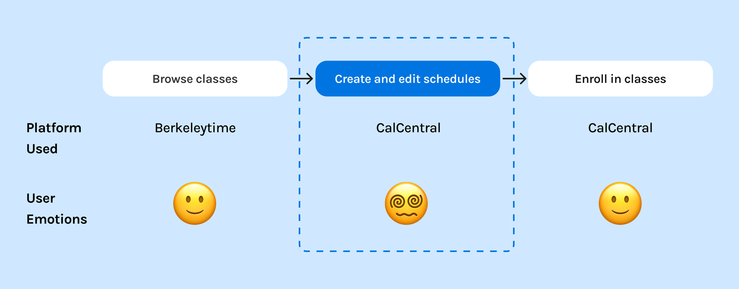
Even during early user testing, all 5 participants said that they preferred Berkeleytime Scheduler’s UX over CalCentral’s.
Provided a more intuitive course planning experience than CalCentral (official schedule enrollment site).
“[Scheduler] has been hugely successful, and many users say they prefer it to the CalCentral enrollment planner.”
— Current Berkeleytime Product Manager
CONTEXT
Berkeleytime is a course-discovery platform for UC Berkeley students.
It allows students to look up courses from previous semesters, view current enrollment trends, and examine past grade distributions.
PROBLEM
Class scheduling was convoluted because there was a lack of centralized tools.
A user survey of 100 participants revealed high interest in a scheduling tool by Berkeleytime, to address common inconveniences while planning next semester’s classes.
“More schedule planning support, anything to prevent me from having to open three different tabs.”
— Student Survey Participant
SOLUTION
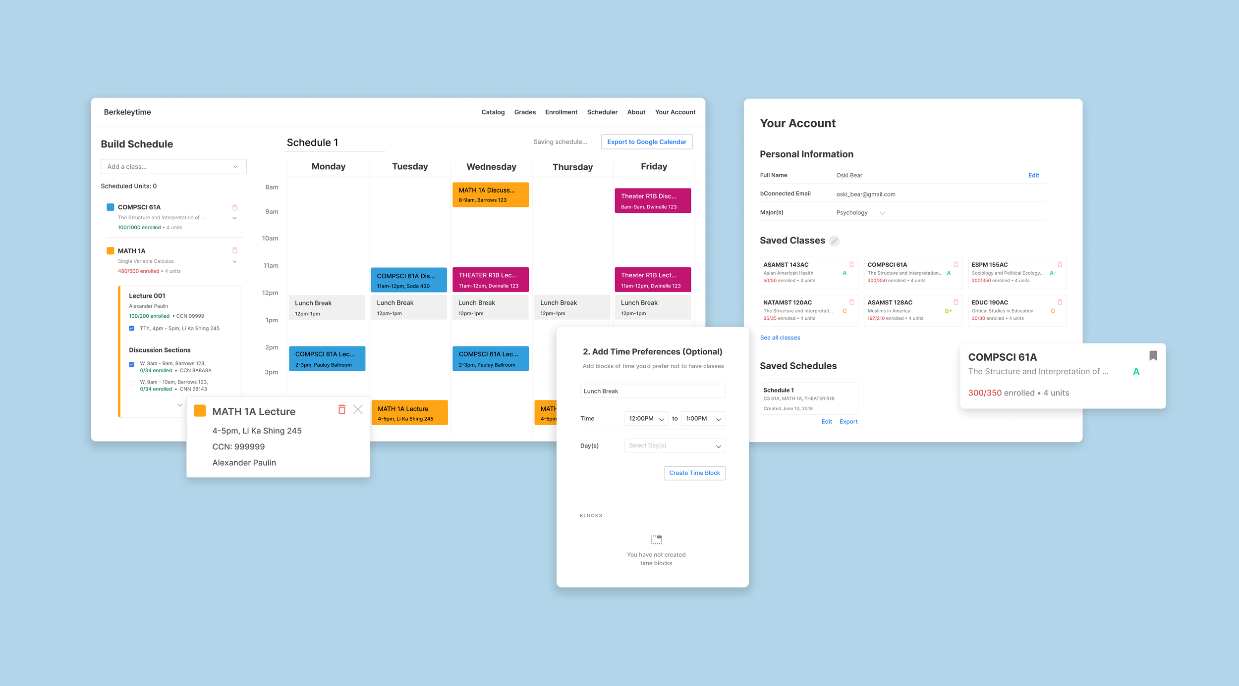
Berkeleytime Scheduler simplifies course scheduling by providing a centralized and flexible experience.
Select and generate a new draft, with no hassle.
View and pick from all possible sections for a class, using either the dropdown class lists on the left or the calendar blocks on the right. Hovering over a specific discussion timeslot will change it from semi-opaque to fully opaque.
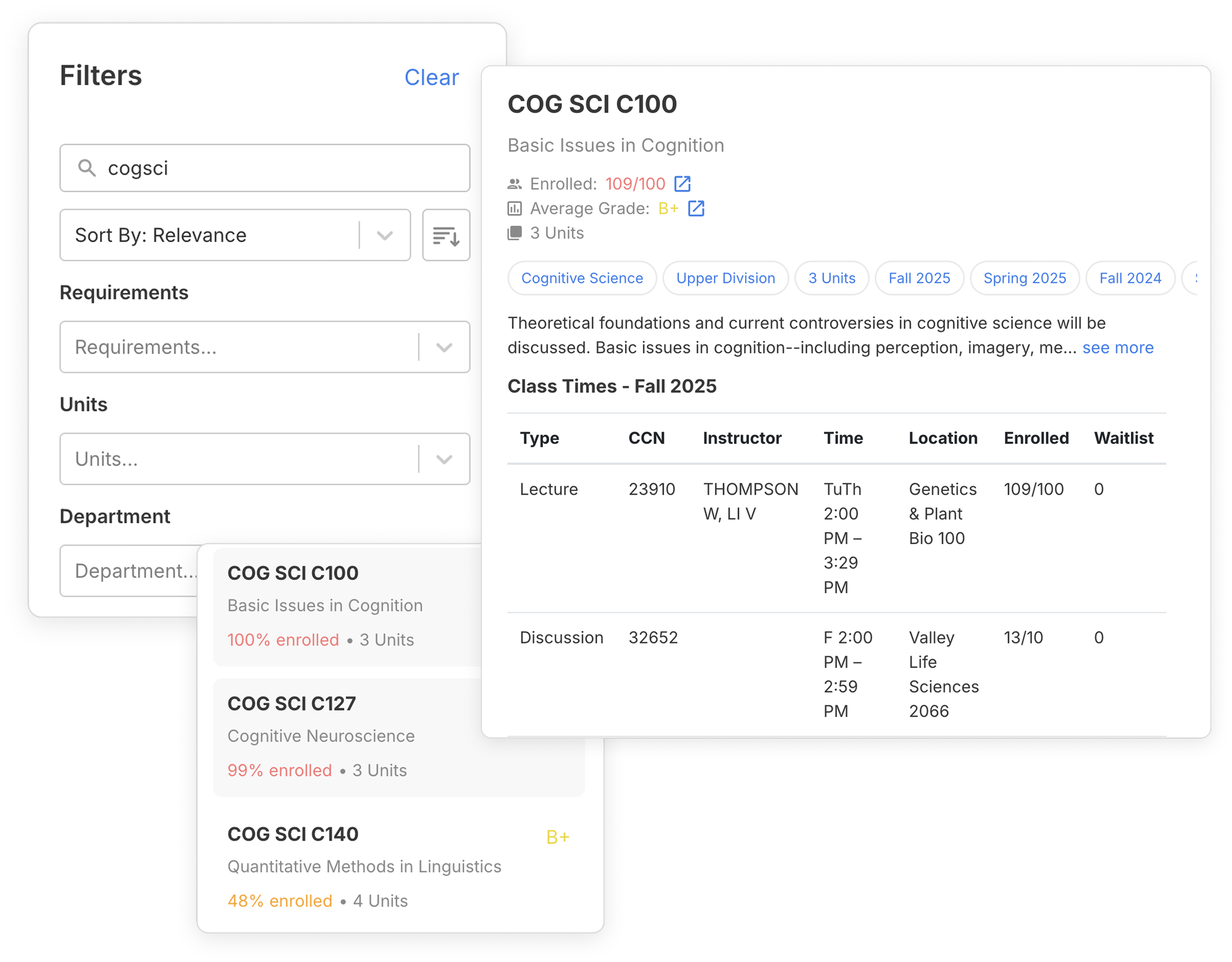
View and select from 11,000+ classes in a single page.
Immediately begin searching and adding classes to start comparing time blocks. Students can also input custom time blocks to keep other commitments in mind.
Find and resolve schedule conflicts in just a few clicks.
Schedule overlapping classes, temporarily or permanently, without irritating error messages. To delete a timeslot, click on the calendar block to access the delete option, or unselect it in the list view.
Keep all potential courses and schedules in a single place.
Students can bookmark potential classes to quickly refer to them later. They can later view saved classes in their Berkeleytime profile, and then add these classes to schedule drafts.
DIGGING DEEPER INTO THE PROBLEM
A scheduling tool already existed: CalCentral. Unfortunately, most students found it confusing and difficult to use.
Generally, students would use Berkeleytime to browse courses to take, and then go CalCentral to start planning out their schedules. What we found was that this crucial step in the course enrollment process was often a hassle for students because CalCentral had a confusing user flow and layout.
CALCENTRAL PAIN POINTS
Given limited time to conduct primary user research, we conducted a heuristic evaluation to identify key pain points with CalCentral.
Our team was already aware that there was high-level user frustration with CalCentral. Despite not being able to conduct in-depth primary user research, we were able to identify actionable opportunities to focus on for a Berkeleytime Scheduler MVP.
CalCentral’s scheduling process was confusing and inflexible.
I identified the main painpoints of current scheduling via CalCentral:
Class shopping cart is text-heavy without additional visual aids
Must keep mental track of info on multiple pages to compare different timetables
Course conflicts are difficult to resolve
OPPORTUNITY
Expand Berkeleytime from a course discovery platform to a comprehensive schedule planning one, while addressing pain points with CalCentral.
To improve upon the current schedule planning UX, the design team turned CalCentral pain points into design objectives for Berkeleytime Scheduler:
How to make schedule creation and class selection transparent?
How to improve the class and schedule comparison process?
How to enable easy course conflict detection and resolution?
DESIGN HIGHLIGHTS
Grouped course sections for better visibility and organization.
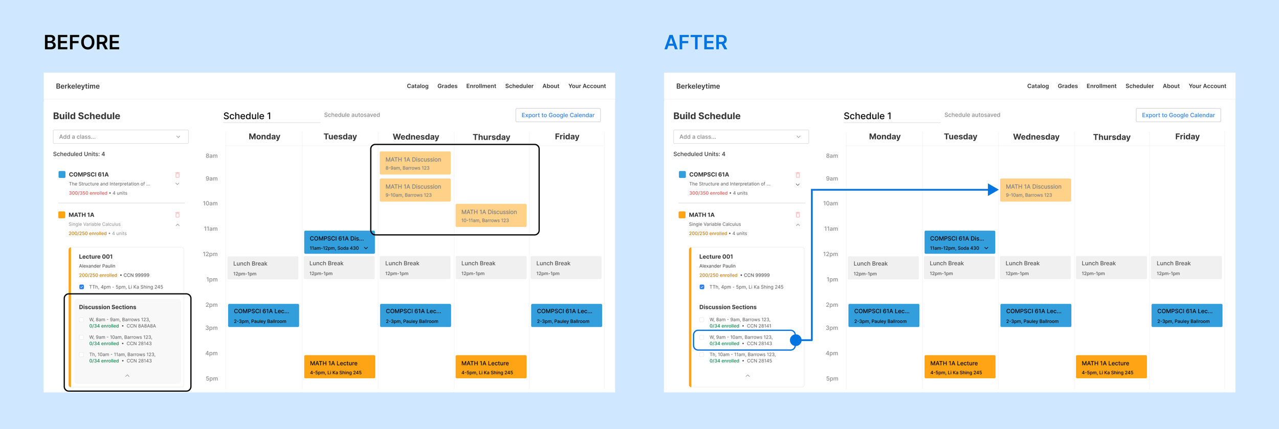
Course sections used to be displayed in no particular order. Grouping them together reduced the time spent identifying all required sections to enroll in, and more effective schedule visualization.
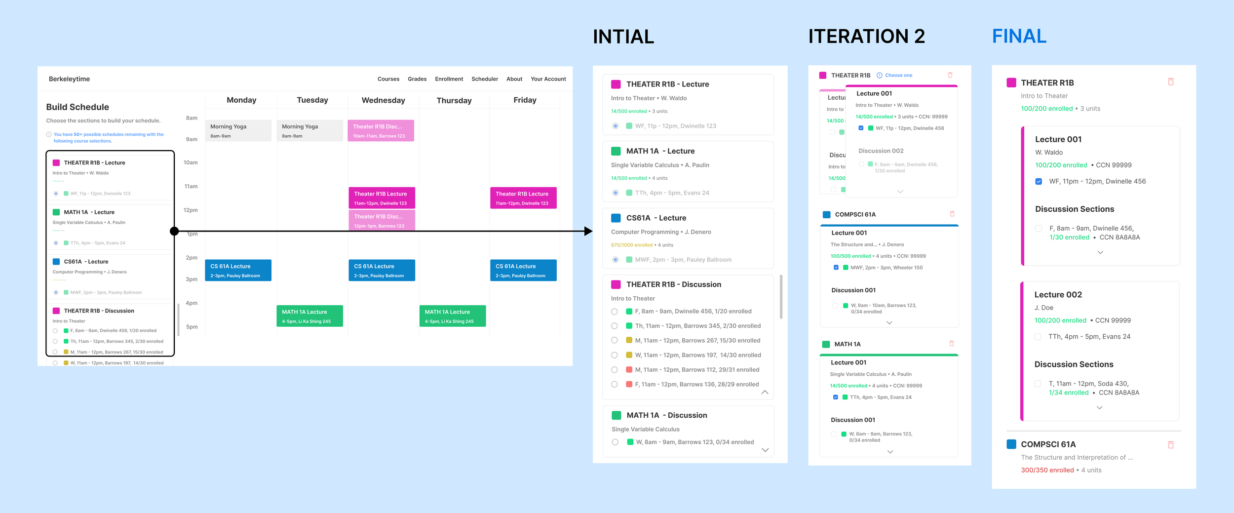
Due to technical constraints, designed a simpler course discussion selection process that was still “flexible enough”.
Initially, I wanted the user to be able to visualize ALL possible course discussion timeslots during the selection process. Due to later technical constraints, I chose to scale back and instead allow the user to visualize one timeslot at a time as they hovered through the card view. This user flow was still a huge improvement over CalCentral’s much more rigid process.
Made course conflict notifications less intrusive, but still noticeable.
This enabled that the conflicts were still easy to identify and resolve, without alarming the user with a major UI change that they found irritating.

REFLECTIONS AND TAKEAWAYS
Clarity and patience are pre-requisites when aligning with non-design stakeholders.
As a designer, I knew all the new changes to wireframes and features like the back of my hand—so it was easy to forget that the engineers weren’t going to start on the same page as me. Patiently answering their questions and walking them step-by-step through user flows helped the engineers co-design Scheduler, kept me up-to-date with what would be feasible, and helped me re-examine and polish past design decisions.
If I had more time, I would’ve further explored how to design Scheduler for scale.
The course discussion selection process requires the user to manually scroll through all timeslots. This is fine for courses with just 2-3 discussions to pick from—but what about 50? 100+? There is definitely a strong opportunity to improve the UX for this particular step, maybe by making the discussion selection space much bigger or adding robust filtering features.